
OVERVIEW
Miscommunication and lack of communication create some of the biggest problems within relationships. This is a daily problem of mine as well as the people around me, so I set out to see who else had this problem too and if I could find a solution. After conducting primary research I found that this problem affects 80+% of people.
MY ROLE
This was a personal side project where I focused my efforts on designing a solution to a problem people have.
The Problem
People are forgetting to reply to their messages.
The Users
iPhone users who have an interest in improving their digital communication.
The Opportunity
The user could remember to reply to messages easier.

PRIMARY RESEARCH
I conducted a survey to collect qualitative data to better understand the user need I was attempting to serve.
TWO MAJOR TAKEAWAYS
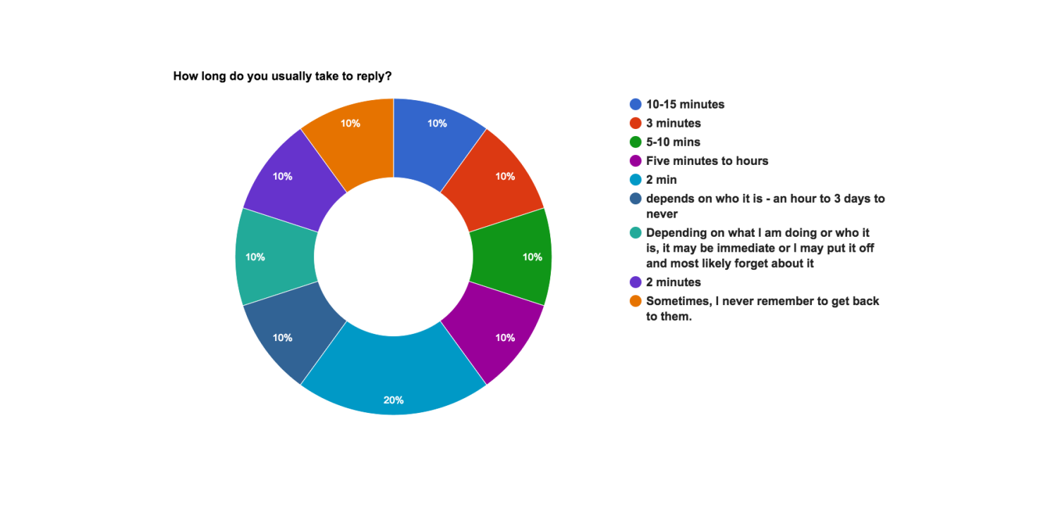

More than 80% of people I surveyed have difficulty replying to messages, so I knew I needed to create a solution.
Current Customer Journey Map
I decided to depict what happens when people get notifications and the possible effects their actions can have.

Possible Features
I sent out questions regarding possible features so I could further define what the need was. The users responded mostly positive to two features, which I implemented in the interaction.


PROCESS SKETCHES
Flow Chart
I created a current and future flow chart to show the options and the process of the different paths that go with each. These two charts compare the before and after the implementation of the functions designed.


Wireframes
Once I found the problem and some possible solution implementations, I started making lo-fi wireframes to find out exactly how I wanted the feature to work when somebody interacted with it.


Decision Making
This is part of my decision making process. I decided some of these options did not fit Apple's Brand Identity. Apple has a clean, simple look with maximum functionality, so I tried to keep my design within those constraints.

Recommendation: VIEW User Testing(below) BEFORE TESTING THE PROTOTYPE
Prototype
I created a prototype to portray the idea in a way the users could tangibly test it out. I used the screens I created in Sketch to create a clickable prototype in InVision. It was important to me to be able to show this function actually happen.
There are a few things I address in the user testing video (below) as far as parameters of the prototype such as: the prototype works through taps only, the bottom of the screen functions as the home button and there are 3D touch functions as well as normal actions.
User Testing
I took the function and tried it out with multiple people. One of which, I recorded using Lookback through InVision. I instructed the user on the parameters of the prototype, gave the user actions to execute and found out information as to why they acted the way they did.